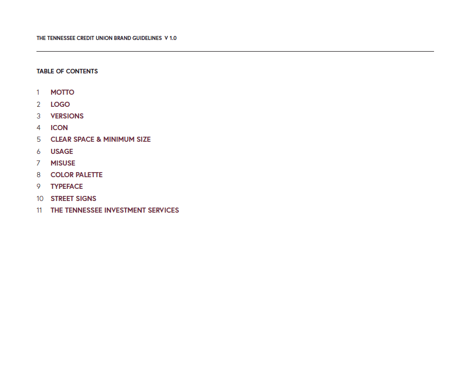
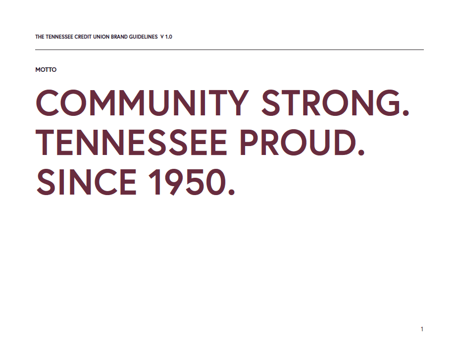
Rebranding The Tennessee Credit Union involved a strategic overhaul of its visual identity, messaging, and customer experience to better align with its evolving values and market position.
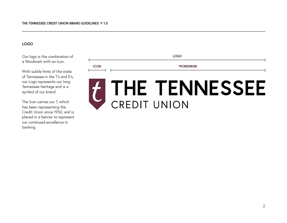
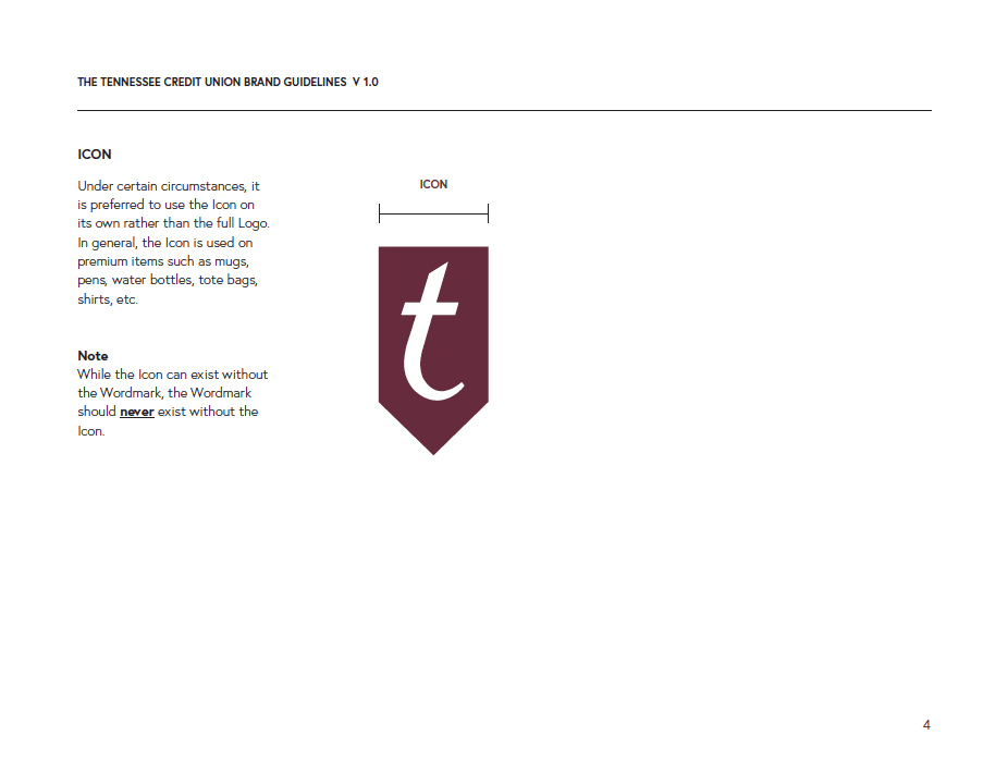
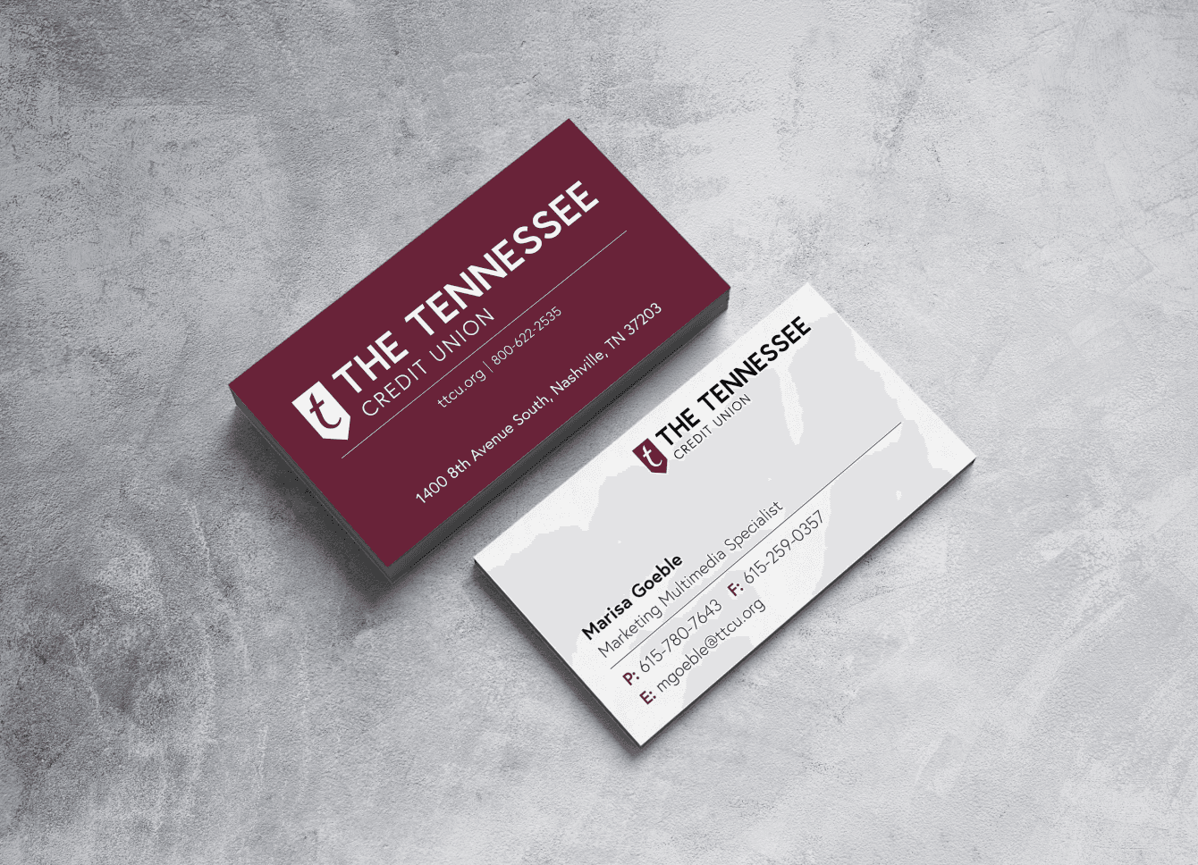
I started the process by understanding the credit union's mission, core values, and customer base, then identifying how the previous brand was perceived. This overhaul included a redesigned logo, an updated color palette, and an update of all marketing materials.
Key steps included
Research & Strategy:
Gathering insights from members and stakeholders about their perception of the brand.
Visual Identity Update:
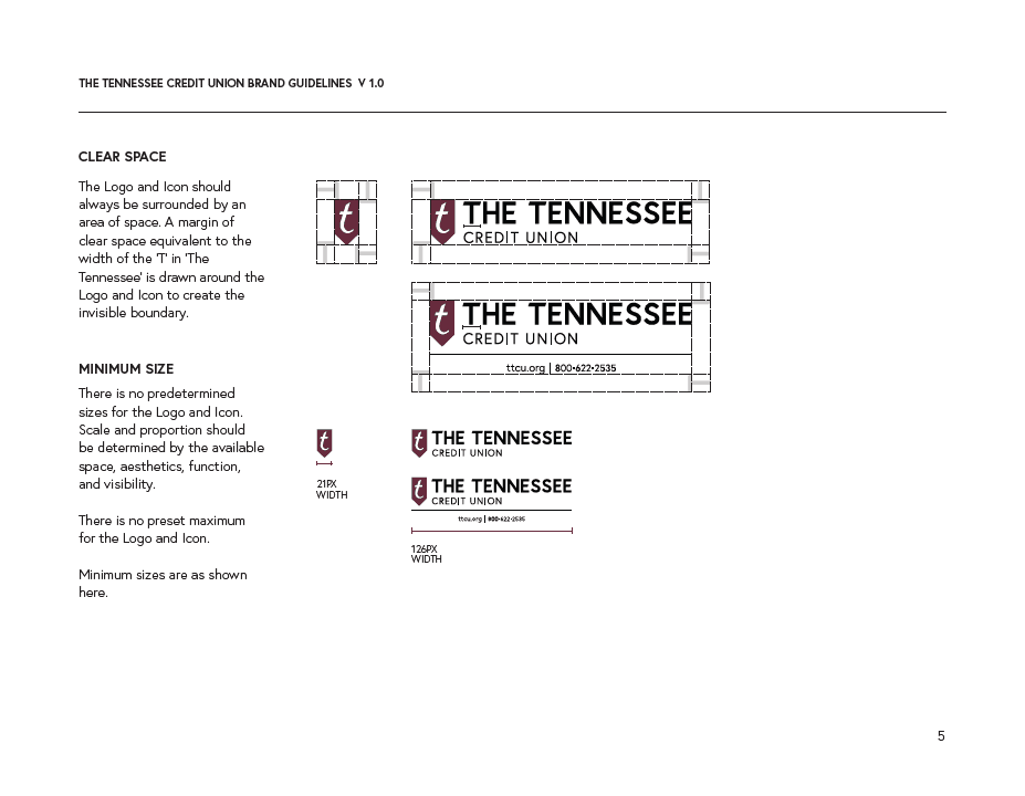
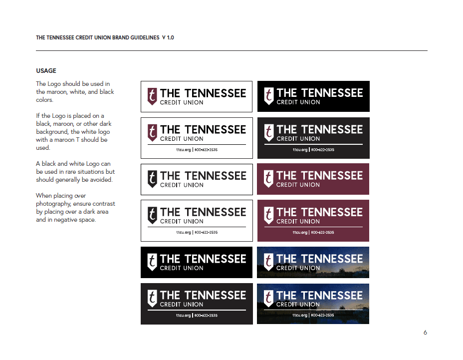
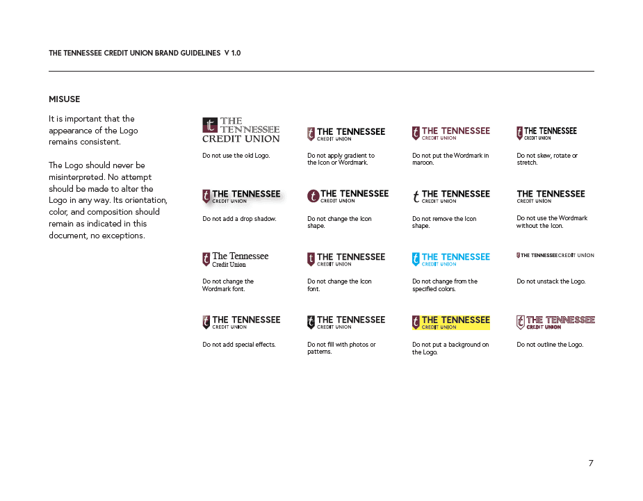
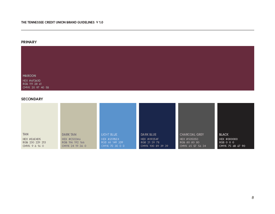
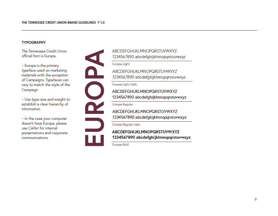
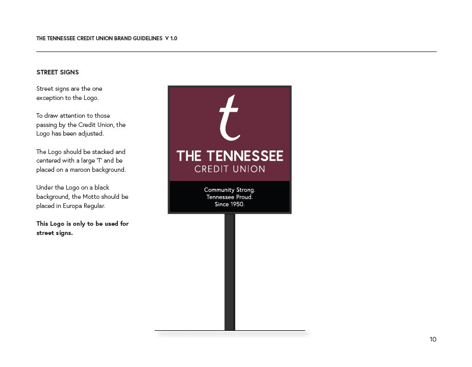
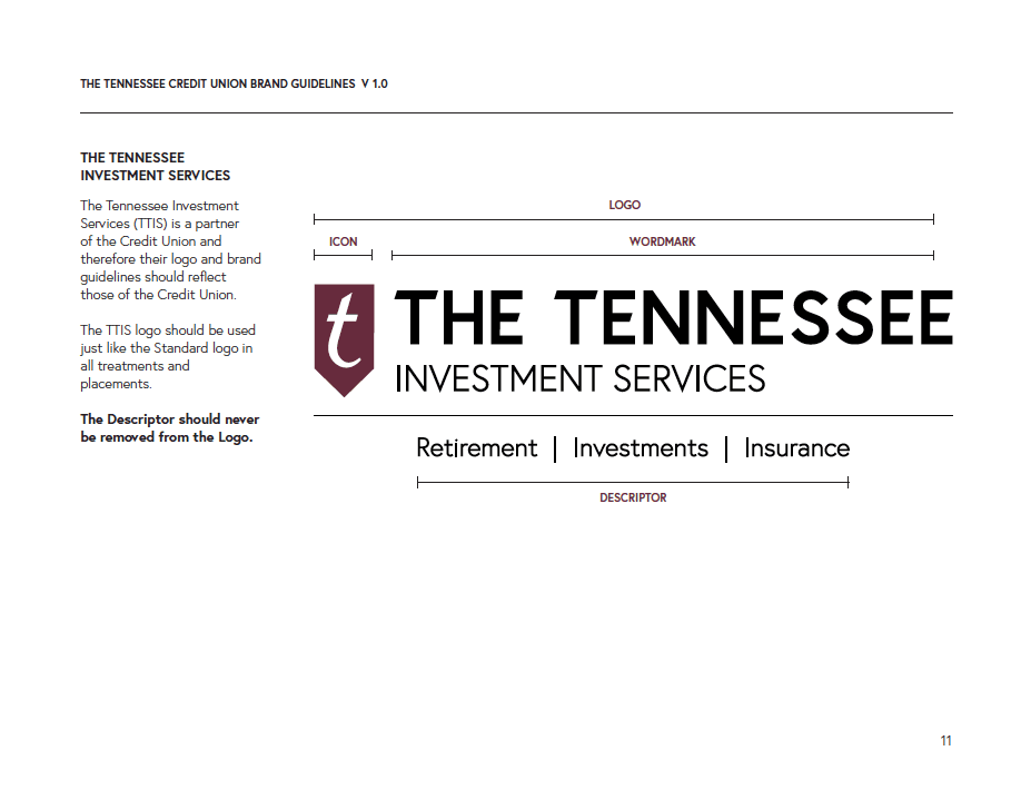
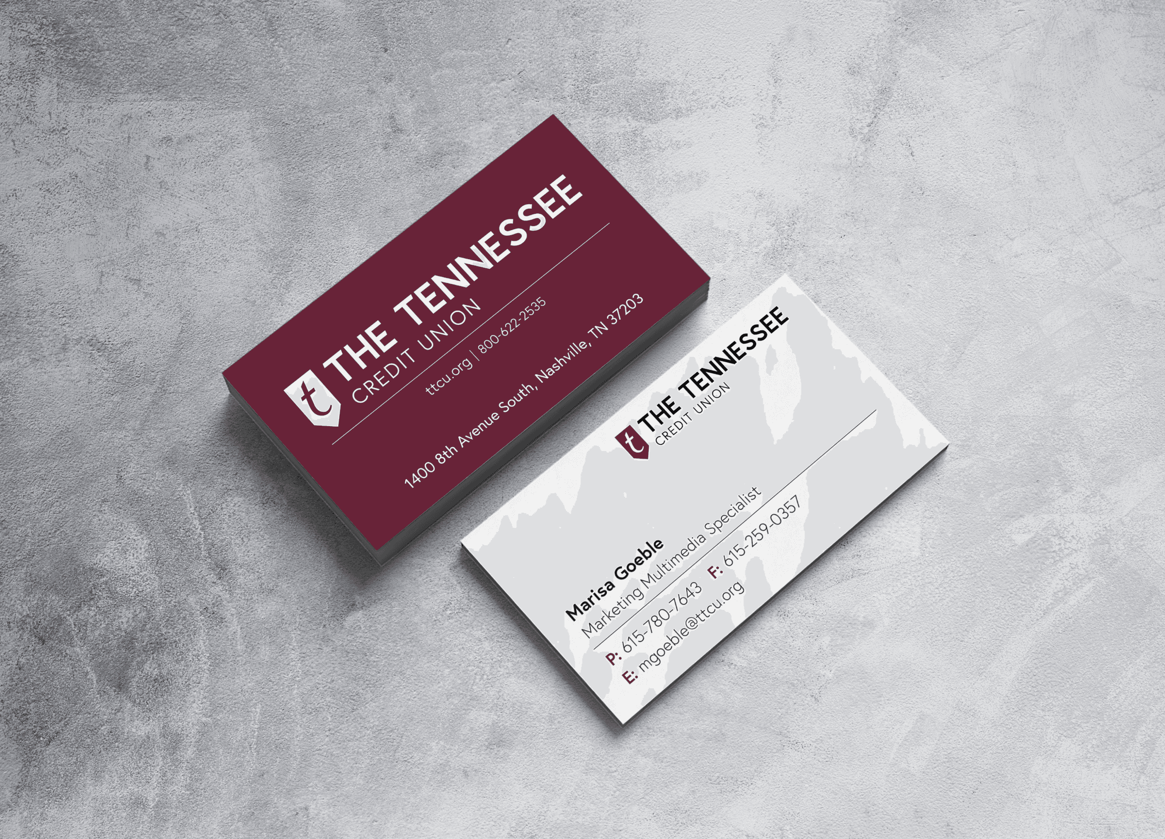
Redesigning the logo, colors, fonts, and overall aesthetic to reflect modern banking trends while retaining elements that communicate trust, stability, and community roots.
Messaging & Voice:
Redefining the credit union’s tone of voice across all platforms—ensuring it is approachable, transparent, and resonates with a diverse audience.
This extended to taglines, marketing materials, and digital content.
Digital Presence:
Enhancing the website, mobile app,
and social media platforms to ensure a user-friendly and cohesive experience. This involved revamping the interface, improving navigation, and optimizing mobile banking experiences.
Community Engagement:
Building campaigns and partnerships that highlight the credit union's commitment to the Tennessee community, reinforcing the personal, localized nature of their services.
By carefully aligning The Tennessee Credit Union’s new brand with modern consumer expectations and its longstanding values, the rebranding effort created a refreshed image that boosts member engagement, attracts new demographics, and solidifies the credit union’s place in an increasingly competitive market.
2018—
Logo redesign
and rebrand



2018—
Logo redesign
and rebrand

Rebranding The Tennessee Credit Union involved a strategic overhaul of its visual identity, messaging, and customer experience to better align with its evolving values and market position.
I started the process by understanding the credit union's mission, core values, and customer base, then identifying how the previous brand was perceived. This overhaul included a redesigned logo, an updated color palette, and an update of all marketing materials.
Key steps included
Research & Strategy:
Gathering insights from members and stakeholders about their perception of the brand.
Visual Identity Update:
Redesigning the logo, colors, fonts, and overall aesthetic to reflect modern banking trends while retaining elements that communicate trust, stability, and community roots.
Messaging & Voice:
Redefining the credit union’s tone of voice across all platforms—ensuring it is approachable, transparent, and resonates with a diverse audience.
This extended to taglines, marketing materials, and digital content.
Digital Presence:
Enhancing the website, mobile app,
and social media platforms to ensure a user-friendly and cohesive experience. This involved revamping the interface, improving navigation, and optimizing mobile banking experiences.
Community Engagement:
Building campaigns and partnerships that highlight the credit union's commitment to the Tennessee community, reinforcing the personal, localized nature of their services.
By carefully aligning The Tennessee Credit Union’s new brand with modern consumer expectations and its longstanding values, the rebranding effort created a refreshed image that boosts member engagement, attracts new demographics, and solidifies the credit union’s place in an increasingly competitive market.

2018—
Logo redesign
and rebrand


Rebranding The Tennessee Credit Union involved a strategic overhaul of its visual identity, messaging, and customer experience to better align with its evolving values and market position.
I started the process by understanding the credit union's mission, core values, and customer base, then identifying how the previous brand was perceived. This overhaul included a redesigned logo, an updated color palette, and an update of all marketing materials.
Key steps included
Research & Strategy:
Gathering insights from members and stakeholders about their perception of the brand.
Visual Identity Update:
Redesigning the logo, colors, fonts, and overall aesthetic to reflect modern banking trends while retaining elements that communicate trust, stability, and community roots.
Messaging & Voice:
Redefining the credit union’s tone of voice across all platforms—ensuring it is approachable, transparent, and resonates with a diverse audience.
This extended to taglines, marketing materials, and digital content.
Digital Presence:
Enhancing the website, mobile app,
and social media platforms to ensure a user-friendly and cohesive experience. This involved revamping the interface, improving navigation, and optimizing mobile banking experiences.
Community Engagement:
Building campaigns and partnerships that highlight the credit union's commitment to the Tennessee community, reinforcing the personal, localized nature of their services.
By carefully aligning The Tennessee Credit Union’s new brand with modern consumer expectations and its longstanding values, the rebranding effort created a refreshed image that boosts member engagement, attracts new demographics, and solidifies the credit union’s place in an increasingly competitive market.


2018—
Logo redesign
and rebrand
